Your guide to schools, reviews, tours, and travel—all in one place!
SchoolMe is designed to provide parents with all the information they need about schools, including parent reviews, and travel routes from school to home—all without the hassle of navigating multiple websites.


User Research
Five parents participated in the research survey. Their frustrations were added into the persona creation of Julia. And goals were incorporated to make the site an easier way to navigate.

The Challenge
Create a site that offers parents school details, parent reviews, tour sign-ups, and travel options without overwhelming them with excessive data.
THE GOAL
Design an easier and more efficient school finding website for parents to navigate the school search.
THE PROCESS
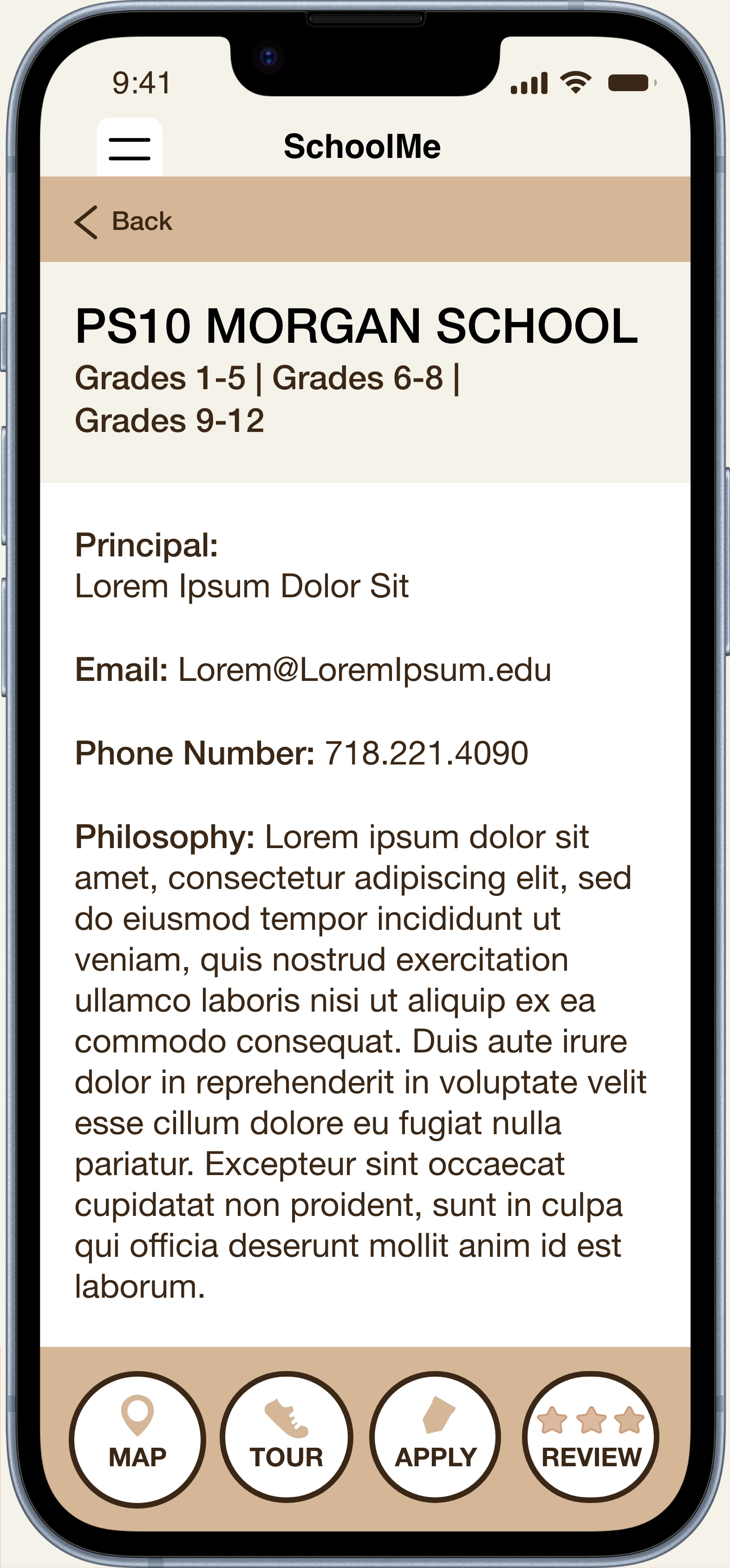
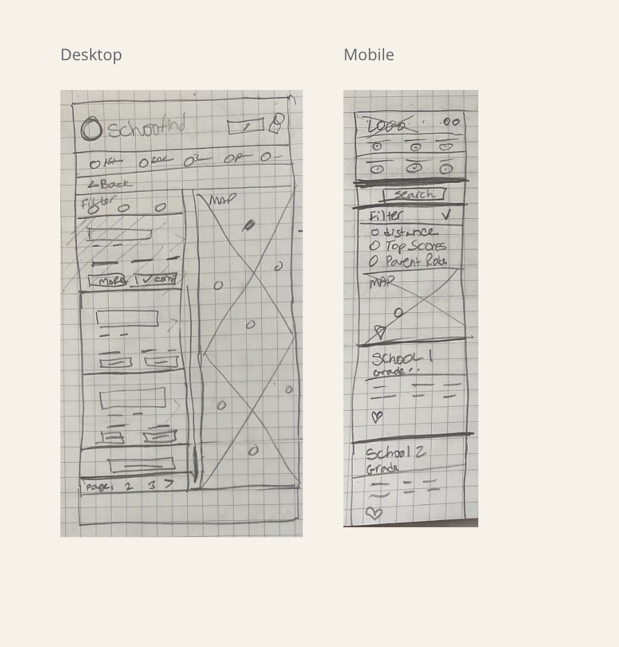
The sitemap helped with simplifing the navigation system to make an intuitive user experience. The wireframes showcased various design options with elements to incorporate into the first prototype. To facilitate accessibility for all users, a responsive site became a key requirement for SchoolMe.
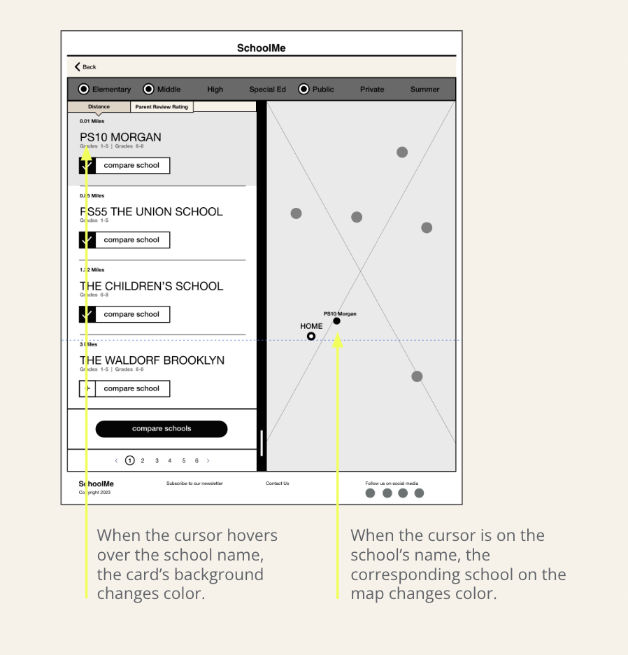
During desktop design phase, I envisioned interactive elements to enhance visual engagement. I designed a card that changes color when hovered over, and highlighted the school’s location on the map, displaying the distance from the user’s home. This concept was developed during the prototype phase to improve both the usability and visual guidance of the site.


Usability Study Findings


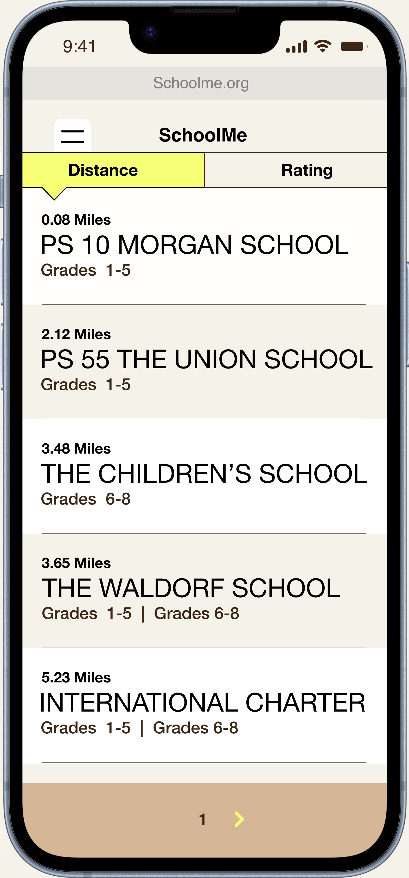
Additionally, participants wanted to have access to information about the distance to schools from their home. However, this information was missed due to an overload of information on one page. In response, the distance info was repositioned to function as a school search option.
Desktop and mobile variations facilitate easy access for people using various devices, resulting in a responsive site.

Mobile Desktop
Project Summary
The objective was to design a website for finding schools. The research revealed that parents often navigated various sites to find information about a school. The challenge required including as much school data as possible without overcrowding the website’s design. Emphasis was placed on creating a responsive site to enhance the user experience across different devices. Additionally, color contrast was highly considered, ranging from 18.83:1 to 10.96:1, ensuring accessibility for users with diverse visual needs.

Next Steps
Users' feedback indicated a positive response to the wealth of school information provided. However, the next steps involve conducting further usability testing to evaluate the effectiveness of the rating filter and to identify whether rearranging schools by distance poses a significant challenge for users.
My Role
UI/UX Designer and Researcher
Responsibilities
User research, interviewing participants, wireframing, sitemap, creating low and high-fidelity prototypes, conducting usability studies, and iterating designs.
Programs
Figma / Google Sheets
UI/UX Designer and Researcher
Responsibilities
User research, interviewing participants, wireframing, sitemap, creating low and high-fidelity prototypes, conducting usability studies, and iterating designs.
Programs
Figma / Google Sheets