Making dining
an inclusive experience
Waiter Service is a restaurant feature that lets diners (including mute and deaf) order, pay, and communicate with the waiter from their phone.
My Role: Researcher, Visual, and UX/UI designer.
Responsibilities: User research, interviewing participants, wireframing, competitive research, low and high-fidelity prototyping, and conducting usability studies.


User Research
I interviewed users for a design of a food ordering app for a family restaurant. The primary user said, “There are times when I don't want to talk to people” which the lead to the waiter service concept of a service that caters to both verbal and non-verbal people.
The usability study confirmed that many users tend to eat when they feel depressed, leading to choosing blue as the primary color. Though most users preferred to order food with a waiter at their table, most were interested with the idea of text messaging instead of speaking. Other findings were annoyance with food names written in foreign languages which made it hard for the user to pronounce the order to the waiter, as well as a lack of calorie info in menus.
The Problem
Restaurants cater mostly to speaking customers. How can it be easier for people with absence of speech to order and communicate with staff?
The Goal
Facilitating people with absence of speech or hearing to easily order and ask questions while they dine-in.

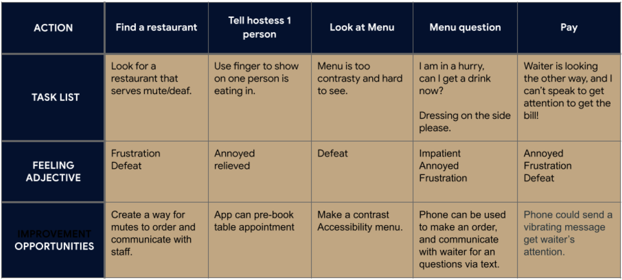
Journey Map
Romulo’s journey map shows the challenges faced by individuals with absence of speech in a restaurant setting.
Wireframes
Paper & Digital
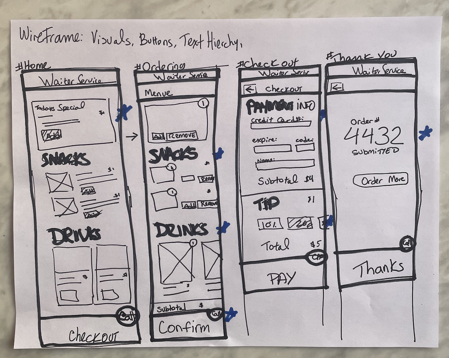 The stars are used to highlight the items to include in the design phase. Using text hierarchy and larger buttons are elements that help emphasize the main focus points.
 The Waiter Service prototype allows users to connect with the waiter by
either texting or calling the waiter to the table. A texting option
allows mute users to easily ask menu
questions.
The Waiter Service prototype allows users to connect with the waiter by
either texting or calling the waiter to the table. A texting option
allows mute users to easily ask menu
questions.Usability Study Findings
 A few (1 out 9) users found the blue was too saturated and bright. In response to visual accessibility concerns, the colors and font size were revised.

The Waiter Service icon was missed by everyone (9 out of 9 times). As a solution, a message about the new icon’s feature was added above the menu. Also, the icon was placed inside each dish to facilitate user questions or comments.
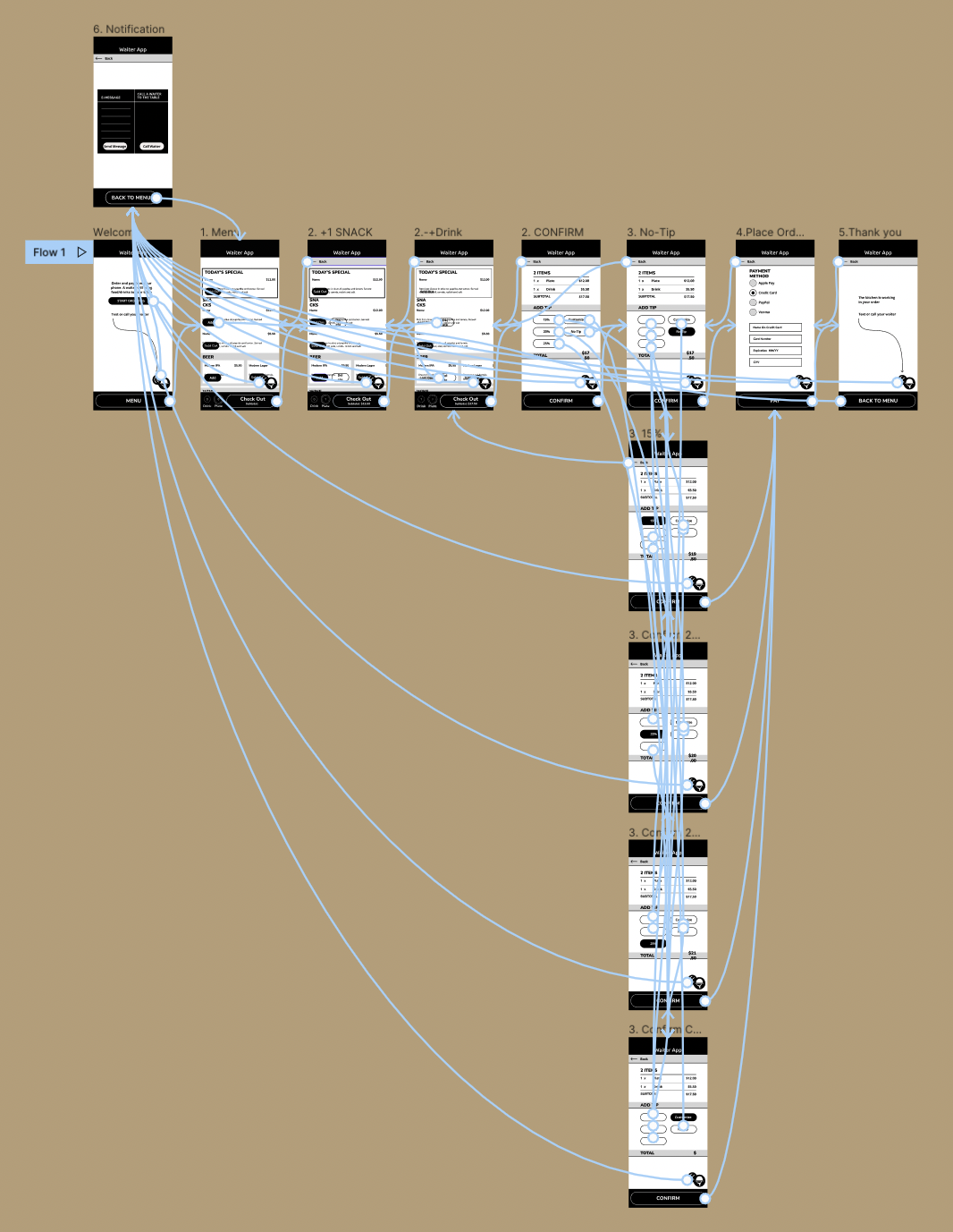
Hi-Fi Prototype

Priority was given to meeting user accessibility needs for communication with their waiter in text or speech form, ensuring easy access for mute individuals. Additionally, for the visually impaired, a larger font size has been incorporated into the design.
Prototype
Takeaway
An interesting discovery was that my initial color choice was deemed too bright by a few users, providing a real-life view into the importance of designing with accessibility. Also, by having larger fonts, the design is friendlier to an older crowd, like my dad, who half of the time forgets his glasses.
An interesting discovery was that my initial color choice was deemed too bright by a few users, providing a real-life view into the importance of designing with accessibility. Also, by having larger fonts, the design is friendlier to an older crowd, like my dad, who half of the time forgets his glasses.
Next Steps
Conduct another round to see if user’s needs have been met. Also, investigate whether foreign dish items and the absensce of calorie information are valid pain points for users.
Conduct another round to see if user’s needs have been met. Also, investigate whether foreign dish items and the absensce of calorie information are valid pain points for users.